This case study focused on reimagining an existing brand, and I chose Conscious Coffees, a Colorado-based company rooted in fair trade, sustainability, and community. Their original identity was clean and minimal, but I saw an opportunity to evolve it into something more expressive—something that told a deeper story while staying true to the brand’s values.
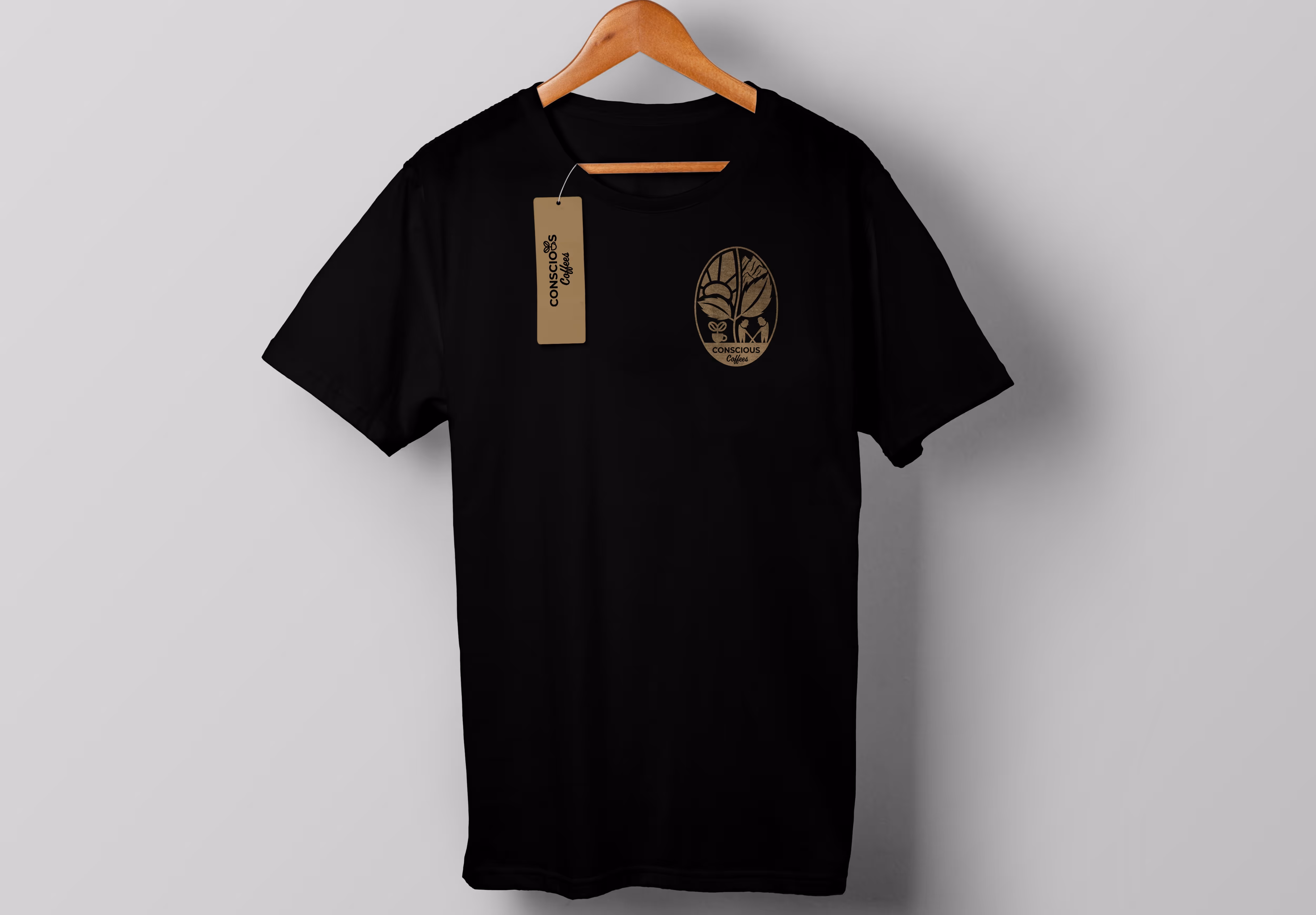
The redesigned logo is fully contained within the shape of a coffee bean, a subtle nod to the product itself. Inside, the design is divided into four visual pillars that reflect Conscious Coffees’ mission: a rising sun shaped like a coffee bean to symbolize their eco-friendly approach; mountain peaks representing their Colorado origin; two farmers working together to honor their commitment to fair trade and community; and a coffee cup sprouting a small plant, blending the café experience with the organic roots of their product. All of these elements are anchored by a warm, earthy palette that helps modernize the look while staying grounded and natural.
This redesign is about more than just aesthetics—it’s a system of visual storytelling that communicates the heart of the brand at a glance.


.avif)